Cairo, Egypt · Open to remote, hybrid, or relocation
sarah_hammad.profile
role Product & UX Designer
based Cairo, EG
remote open
now UX Design Intern, Flyrank
AI startup · since June 2026
focus research · information architecture
prototyping · design systems
Arabic RTL · accessibility
tools Figma · FigJam · Maze
langs Arabic (native) · English (professional)
79
Screens designed for a live product at an AI startup, on a documented token set.
03
Case studies written end to end, each one showing what changed and why: Talla, CareNest, Velora.
AA
An Arabic right-to-left interface built and checked to WCAG 2.1 AA.
Selected work
Three case studies · One in progress
How I work
Four steps in plain language. Not a diagram. This is what actually happens on a project.
01
Find the task, not the feature
I write down what the person is actually trying to finish, then count how many steps it takes them today.
02
Look at what already exists
I benchmark the products people already use, so I know which conventions to keep and which ones are worth arguing with.
03
Get the sequence right first
The flow comes before the screen. Once the order is right, I build the screens and the components they share.
04
Audit it honestly
Heuristic evaluation, an accessibility pass, and a written list of what I would test next if I had users in front of me.
About
I came into design from Business Administration, which is why I start with the task rather than the interface. I work on booking, planning and scheduling products Arabic and English, right to left and left to right. I care more about whether it works than whether it wins an award.
Writing & capstone
first posts, autumn 2026
Notes from the Flyrank internship as it runs, and the capstone project at the end of it. Published here as each one is finished.
Next post
What six competitor apps taught me about endings
Why none of them let you finish, and what I did about it in Talla.
In progress
Designing an Arabic interface that reads properly
The parts of an RTL layout that should not be mirrored, and how I decided each one.
Capstone
Flyrank capstone project
The end of the internship track. Written up in full once it is approved.
Contact
Tell me what you are trying to get people through.
Product or UX Designer roles. Remote, hybrid, or on site, open to relocation.
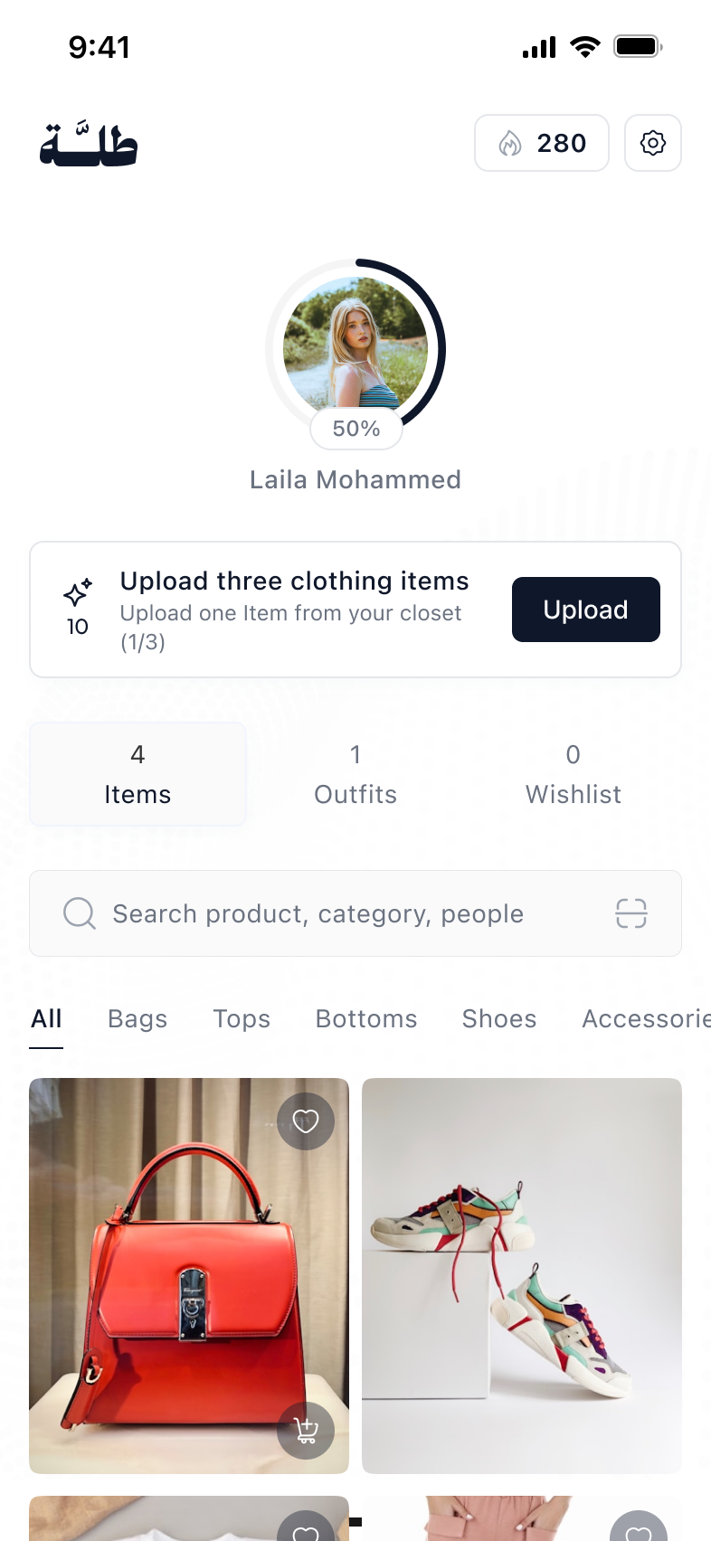
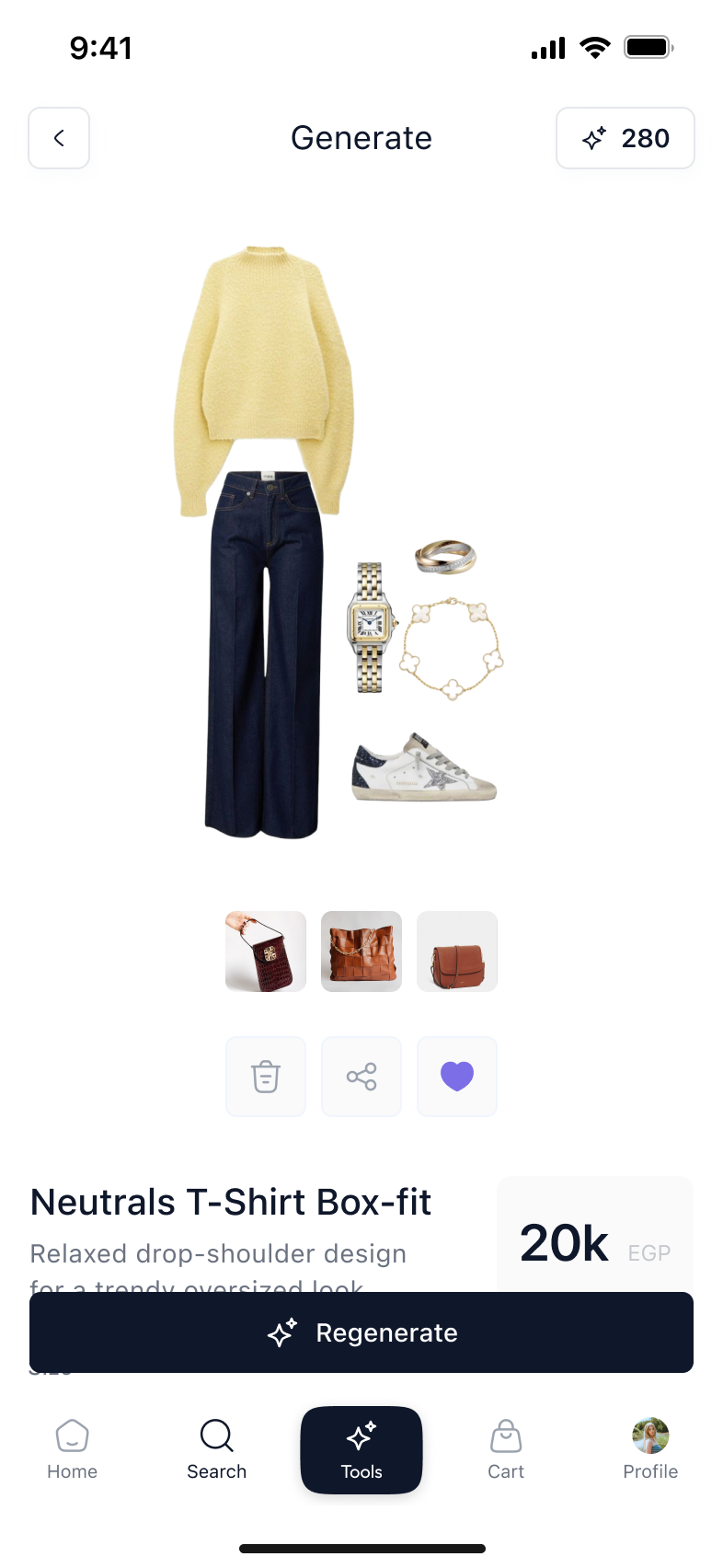
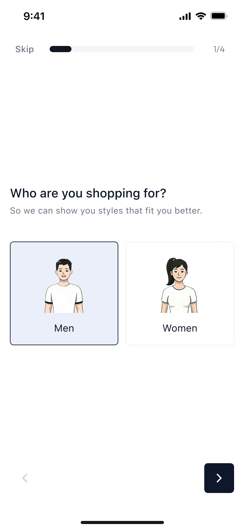
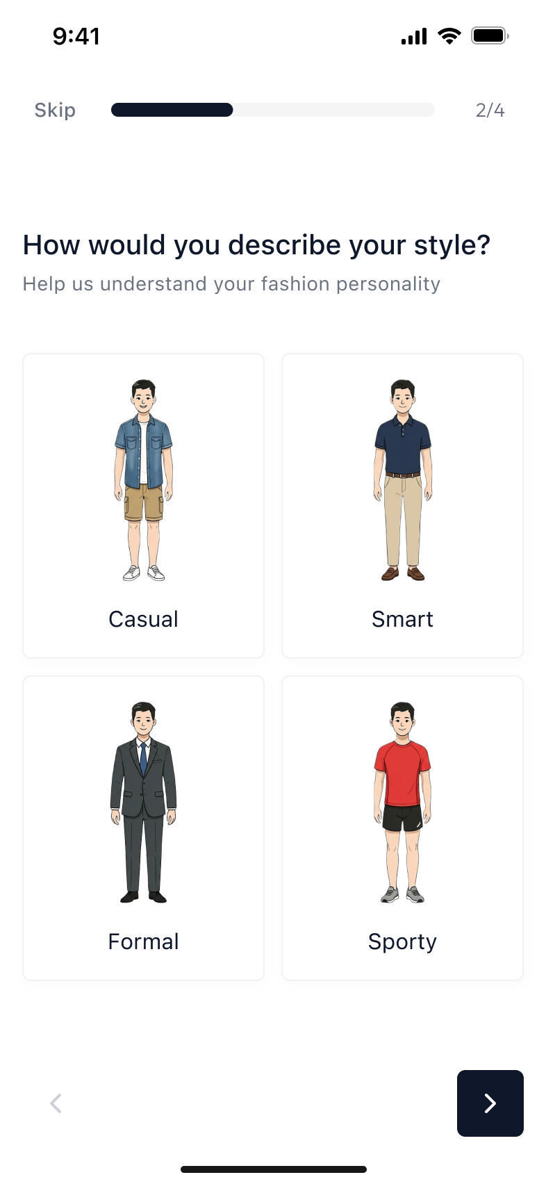
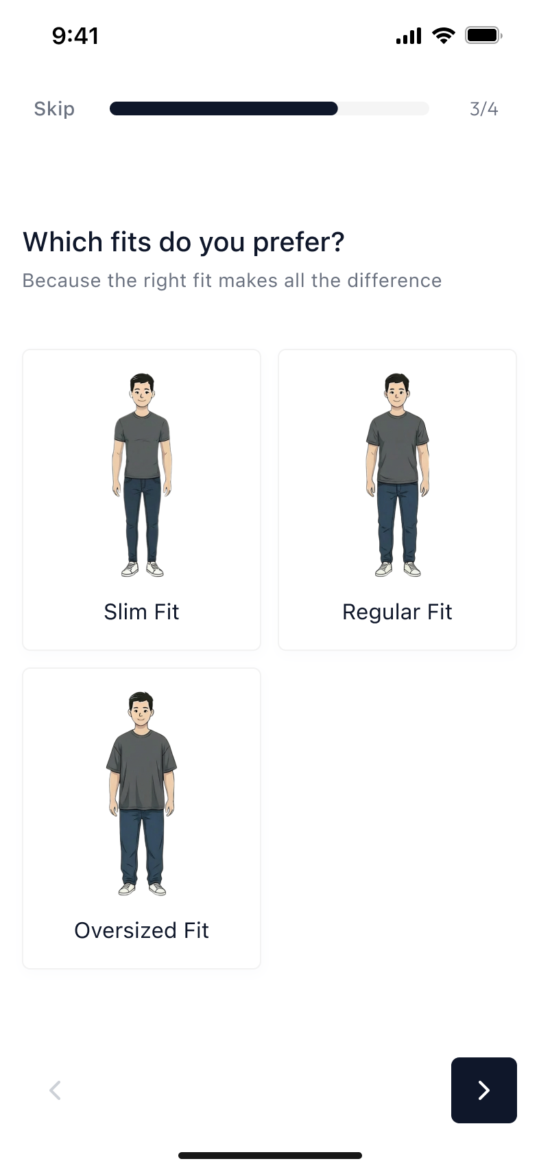
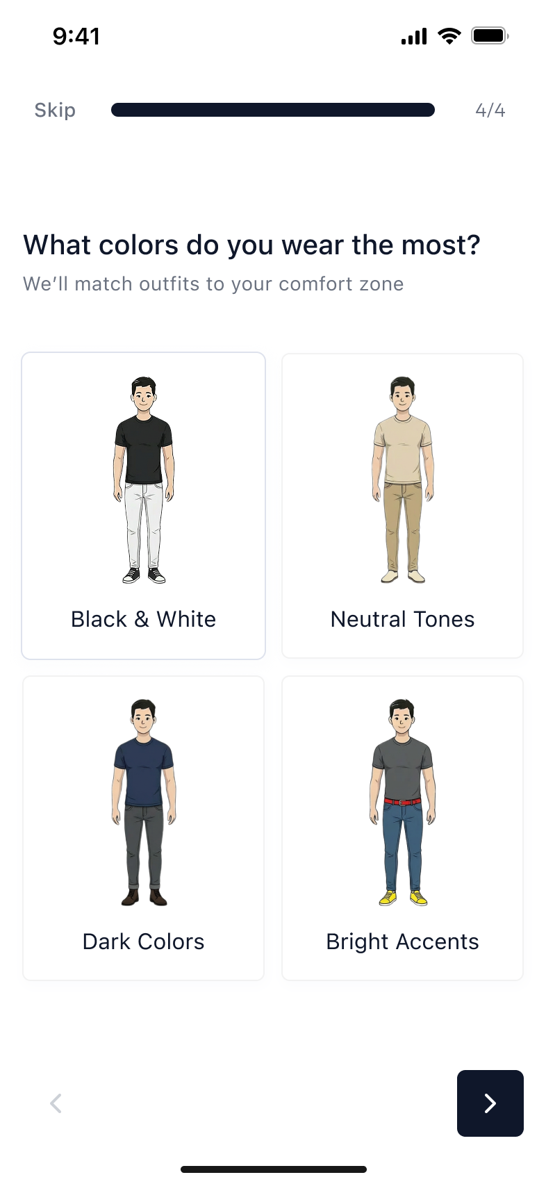
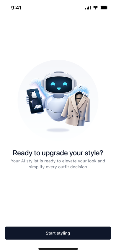
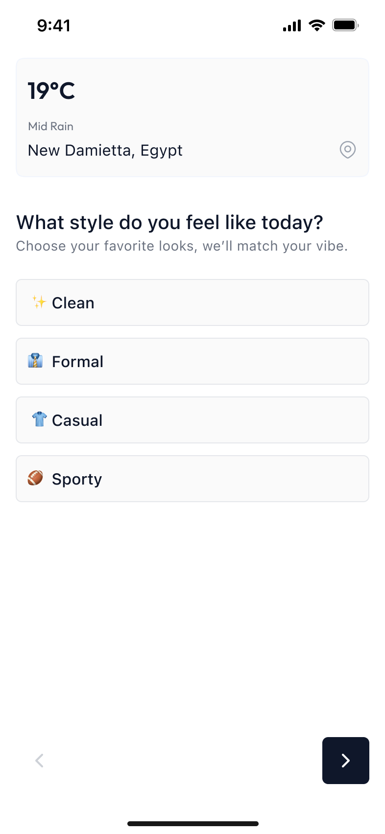
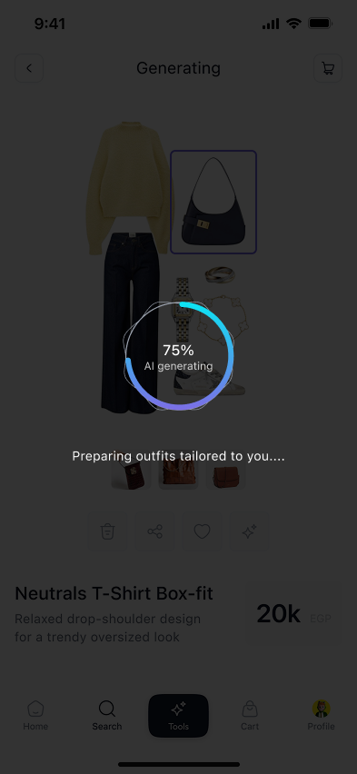
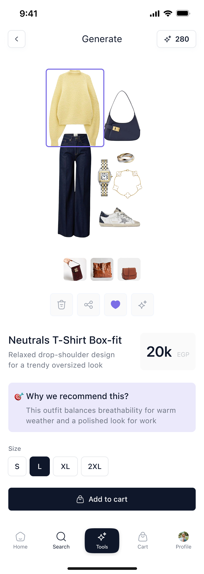
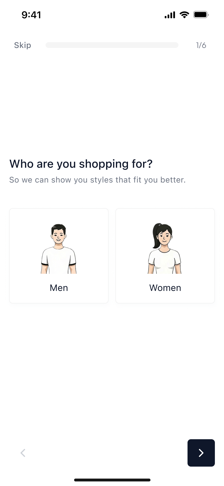
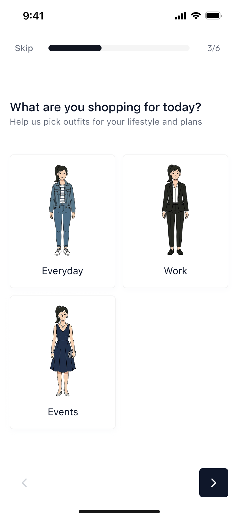
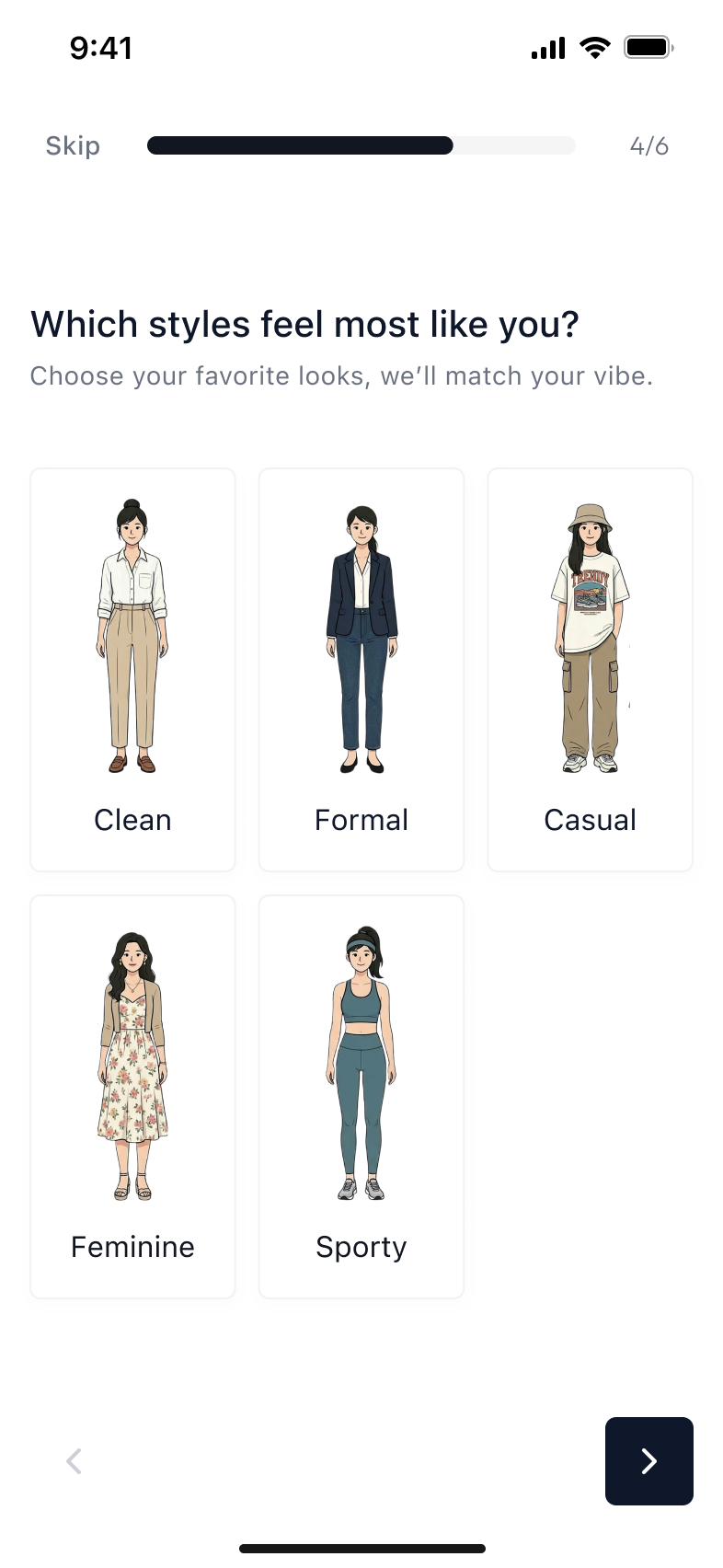
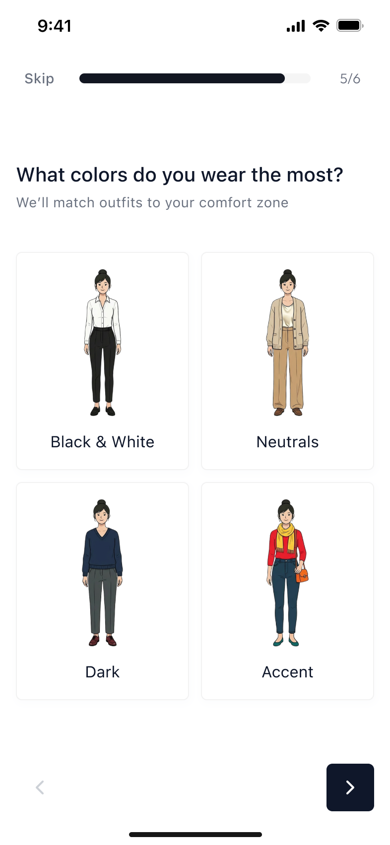
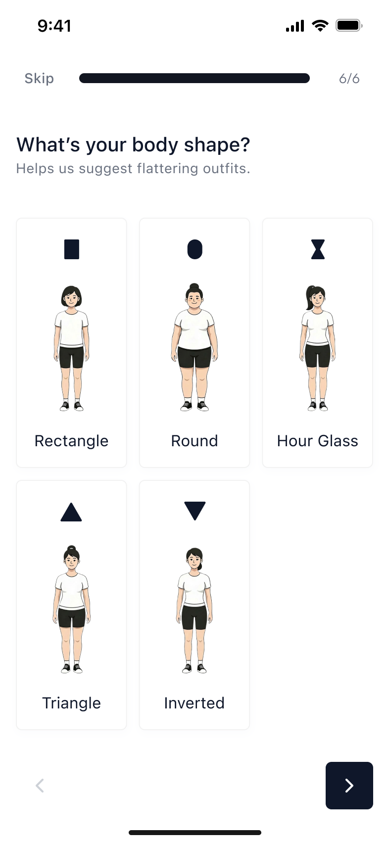
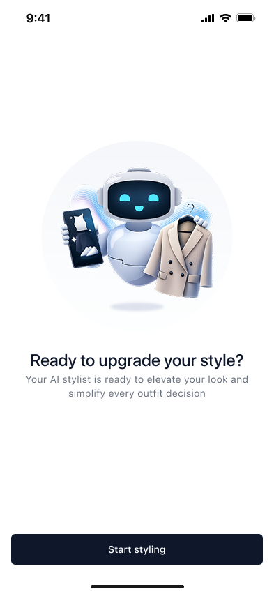
A full wardrobe and no starting point. Talla turns an open question (what do I wear) into a short sequence with an obvious end.
iOS · iPhoneSelf-initiated concept
Wardrobe
Generating an outfit
Shop
Role
Product & UX Designer
Research through UI, solo
Timeline
2025
Complete
Tools
Figma · FigJam · Maze
Prototype linked below
Platform
iOS
iPhone, native patterns
03 · The problem
Getting dressed is a decision with no obvious first step.
People do not lack clothes. They lack a place to start. Most styling apps answer this by showing more, more inspiration, more feeds, more options which is the same problem in a nicer typeface.
Talla had to do the opposite. Narrow fast, decide once, and end the session rather than extend it.
04 · Who it is for
People deciding in the two minutes before they leave.
Not people browsing for pleasure. The design assumes a short session, on the one hand, and a person who already owns the clothes on screen or wants a personalized shopping experience.
That assumption decided nearly everything downstream: how many taps the flow gets, how much the AI is allowed to ask, and what happens when it is wrong.
05 · What I found out, and how
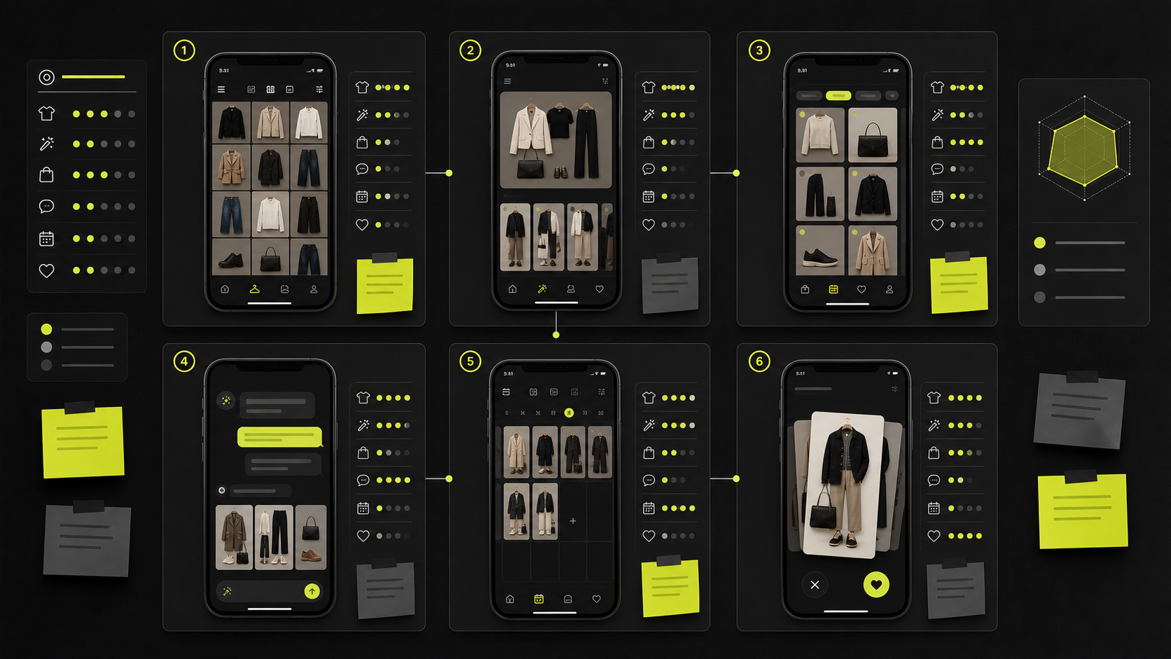
6styling and wardrobe apps benchmarked
Before drawing anything I walked six competing apps end to end and recorded, for each, how long it took to reach one decided outfit and where the flow lost me.
The pattern held across all six: every app was built for browsing, and none of them had an ending. That produced the single requirement: the rest of the design hangs off the flow; the flow must terminate.
Stated plainly: this is a competitive benchmark, not moderated user testing. The full analysis is below so you can check it.
Each app scored on the same six criteria: wardrobe, generation, shopping, conversation, planning and saving. The composite sits on the right.
The six, and what each one leaves open
Competitor
Strength
Gap
Opening for Talla
WheringSocial digital wardrobe and styling app
Uses clothes people already own; clear sustainability angle
Feature-heavy: the social layer competes with a quick decision
Make generation faster and calmer, aimed at daily confidence
AclosetAI fashion assistant and digital wardrobe
Strong AI positioning and personalisation
Free tier caps the wardrobe; onboarding turns into setup work
Give value before the closet is fully uploaded
CladwellSmart closet and capsule wardrobe planner
Excellent for capsule wardrobes and intentional buying
The original flow asked users to answer multiple questions (occasion, weather, style, and colors) before generating an outfit. User testing showed this felt slow and created friction before users experienced the product's value.After
01One question, already answered by default
02The wait happens over the answer, not instead of it
03The outfit, its reasoning, and one decision left · scroll
The redesigned flow generates an outfit immediately using default preferences. Users can then refine the recommendation by adjusting occasion, weather, or style. This delivers value faster while maintaining personalization.
07 · Flows and design system
A component library, not a page of screens.
Every repeated element in Talla is a component with defined states, spacing and type styles. Building the library first is what let the flow change three times without the screens falling apart.
·Named tokens for colour, type and spacing, so a change happens in one place.
·Every component documented with its states, not just its default.
·Built to iOS conventions throughout: native controls, sheets and navigation.
CareNest is a childcare marketplace that simplifies finding, comparing, and booking verified babysitters through a transparent, trustworthy, and localized experience.
Web and mobileSupported LTR and RTLSelf-initiated concept
Role
Product & UX Designer
Research through handoff
Timeline
2025
Complete
Tools
Figma · FigJam
Annotated specs and tokens
Standard
WCAG 2.1 AA
Designed to, and checked
03 · The problem
Childcare is built on trust, but trust is hard to verify.
Parents rely on recommendations, scattered information, and manual communication before making one of their most important decisions.
CareNest puts that information on the first screen and makes the slot itself the thing you tap.
04 · Who it is for
Designed for busy families.
Working parents and single parents who need a faster, safer, and more transparent way to find childcare.
This is why CareNest puts trust first through verified profiles, transparent pricing, and simple booking.
The part worth your attention
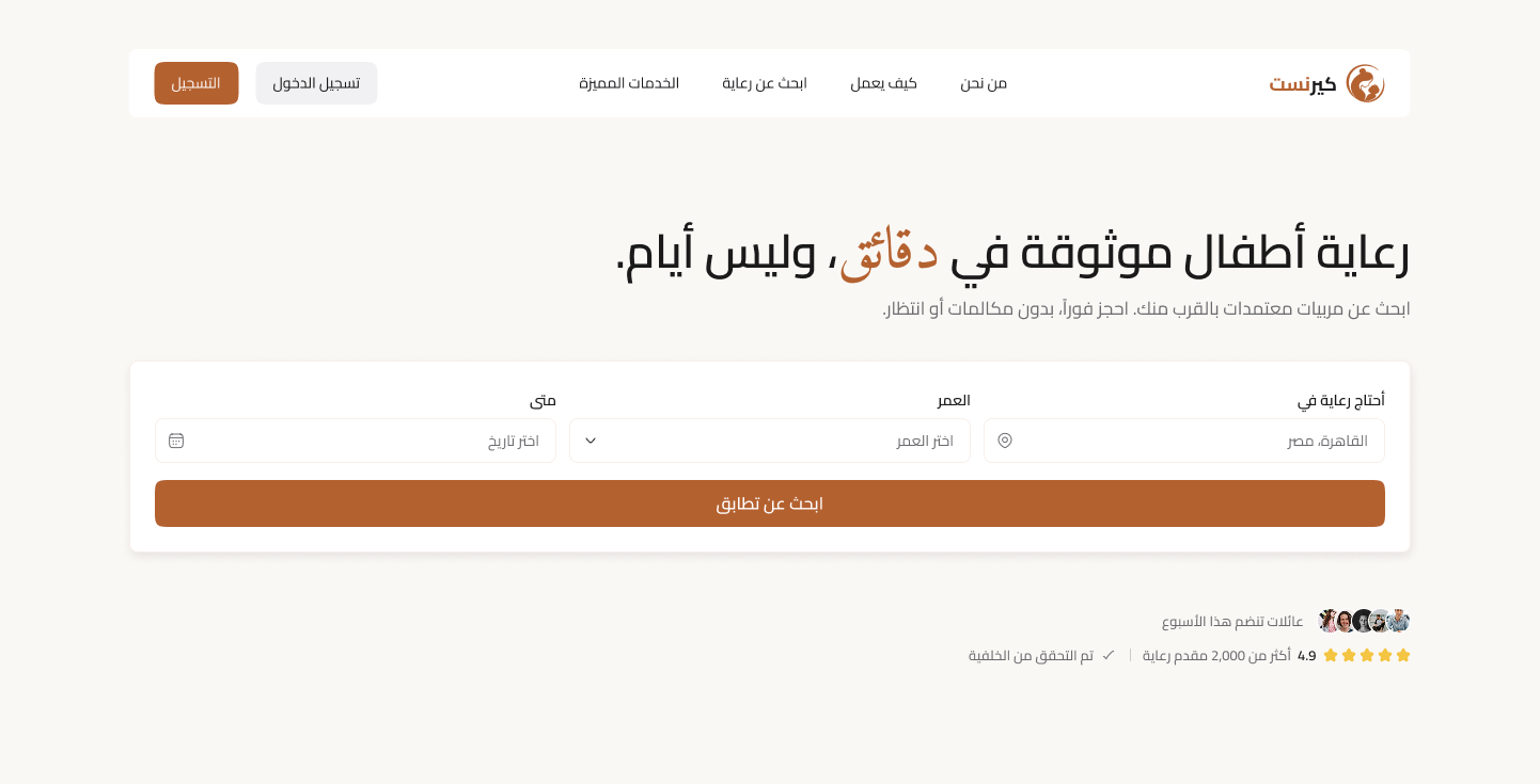
Arabic, right to left, built to WCAG 2.1 AA.
RTL is not a mirror
Direction flips, but progress indicators, time ranges and numerals do not all flip with it. Each one was decided deliberately rather than left to the layout engine.
Contrast and targets, checked
Text contrast, focus order, target size and error messaging were designed against AA and verified, not assumed. The rules are written into the component specs.
Two scripts, one system
Arabic and English share one component library. Line heights and spacing tokens carry values for both scripts so neither reads like an afterthought.
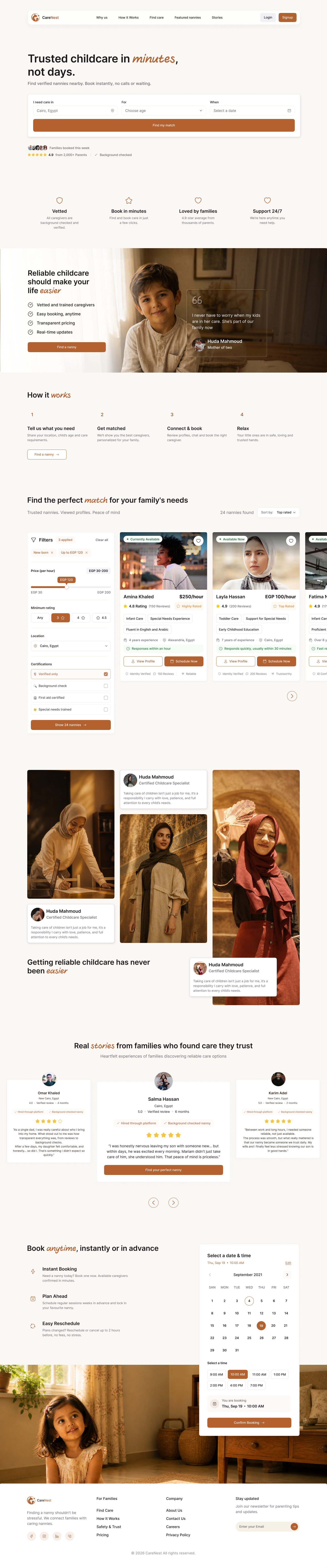
carenest · landing page
Scroll inside the frame for the full landing page: hero, trust bar, how it works, nanny results, family stories and booking.
06 · Key decisions
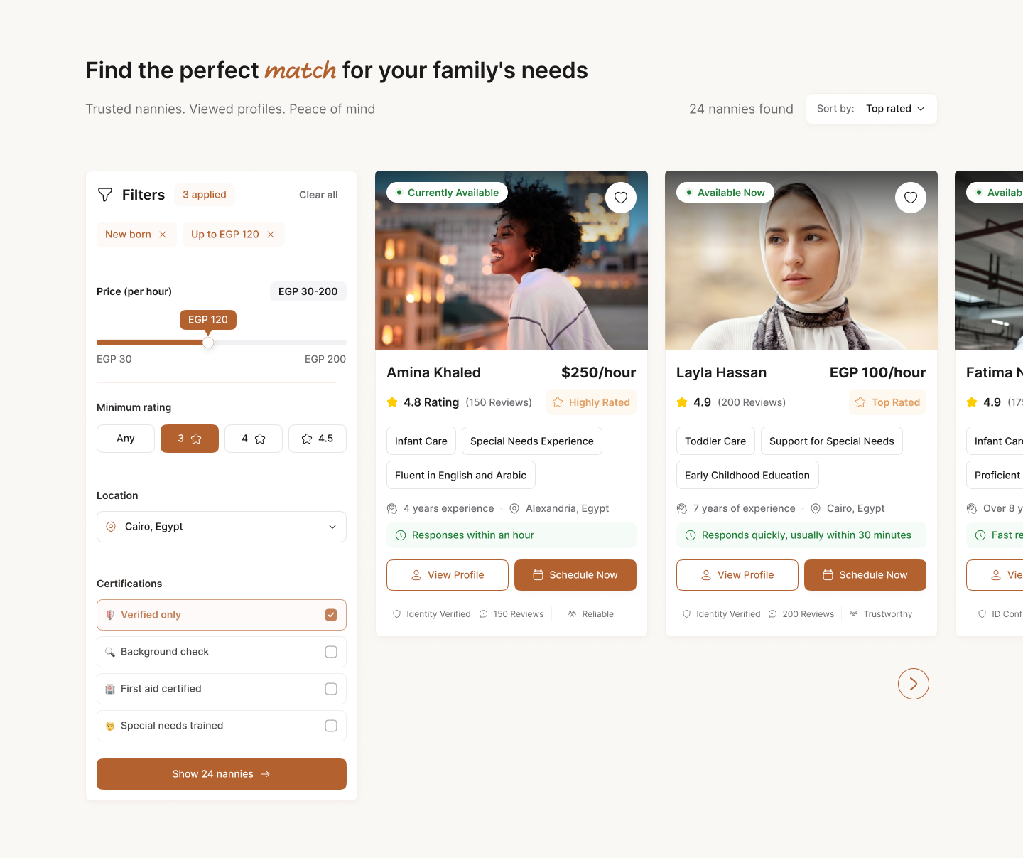
Before
Parents had to browse multiple caregiver profiles before knowing if someone was available in their area.After
Users can begin their search immediately, reducing time to first meaningful action.
07 · Flows and design system
Annotated specs and tokens, handed over.
The library is the deliverable, not a by-product of it. Each component carries its states, its spacing tokens and its accessibility rules in the same place a developer would look for them.
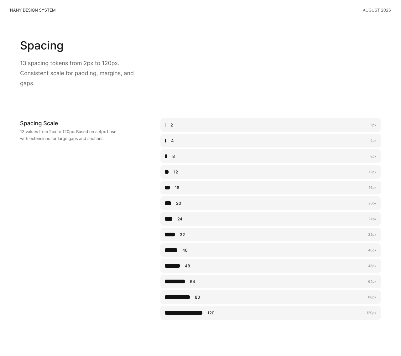
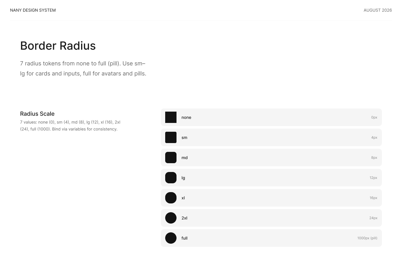
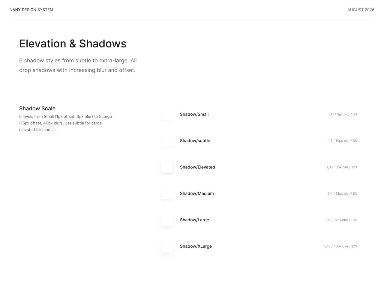
·Tokens for colour, type, spacing and radius, mirrored across both scripts.
·Annotations covering focus order, target size and error text.
·Every state documented: default, active, disabled, error, empty.
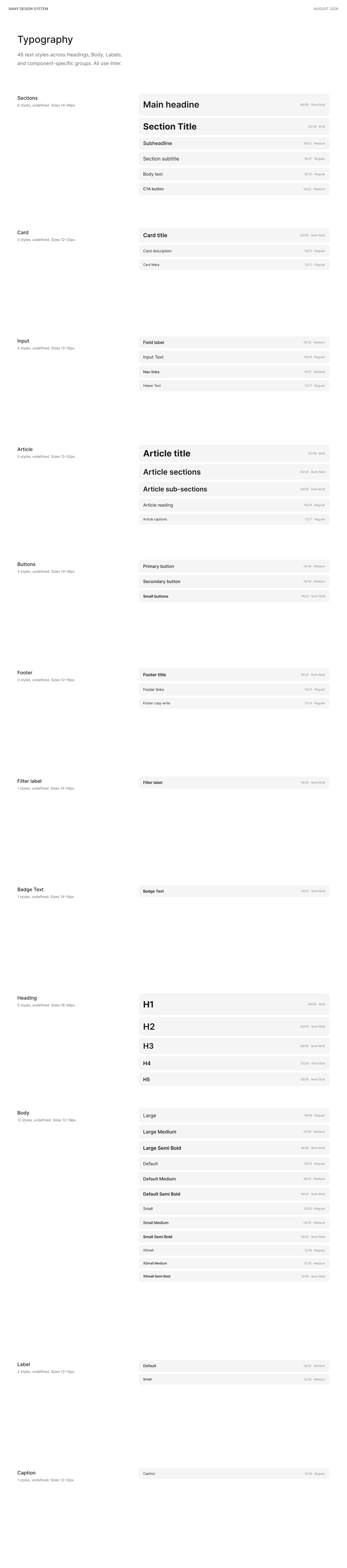
Typography, spacing, radius and elevation, documented as tokens and bound to variables. Scroll the type sheet for all 46 styles.
08 · What I would test next
H1
Would AI-recommended caregivers outperform manual browsing?
A/B testing comparing the current search flow against an AI-powered recommendation flow to measure which leads to more completed bookings.
H2
If parents finding the information they need directly from caregiver cards
First-click testing to evaluate whether users can confidently select a caregiver without opening multiple profiles
H3
If parents complete a booking without confusion
Prototype usability testing using a high-fidelity Figma prototype to identify friction points before development.
Contact
Tell me what you are trying to get people through.
Product or UX Designer roles. Remote, hybrid, or on site, open to relocation.
The hard part of renting a bike is not the bike. It is knowing, before you walk anywhere, that one is waiting for you, what it costs, and how the ride ends. Velora is built around removing that uncertainty, one screen at a time.
iOS · iPhoneCairo, EgyptSelf-initiated concept
Station · scroll
Unlock
Ride summary · scroll
Role
Product & UX Designer
Flow through UI, solo
Timeline
2026
One month, solo
Tools
Figma · FigJam
Components and states
Platform
iOS
iPhone, native patterns
01 · The problem
In Cairo, the short trip is the expensive one.
Two kilometres across the city can cost more in time and money than the distance deserves. Traffic makes a ten-minute journey unpredictable, and the cheap options are not convenient while the convenient ones are not cheap.
A bike covers that distance well. What stops people using one is not the riding. It is everything around it: finding a station, trusting that a bike is there, and not knowing what the ride costs until it is over.
02 · Who it is for
People making the same trip every day, not tourists.
Students, young professionals and daily commuters moving a few kilometres at a time. They are price-sensitive, in a hurry, and often using a service like this for the first time.
That set the bar for every screen: someone who has never rented a bike before should finish the whole rental without asking anyone how it works.
03 · What the design has to answer
Six questions, each one a reason to give up.
Renting a bike is a chain of small uncertainties, and any unanswered link ends the rental, usually before it starts. I wrote them out as questions in the user's words, then decided where each one gets answered and why it belongs there.
The question
Where it is answered
Why there
Where is the nearest station?
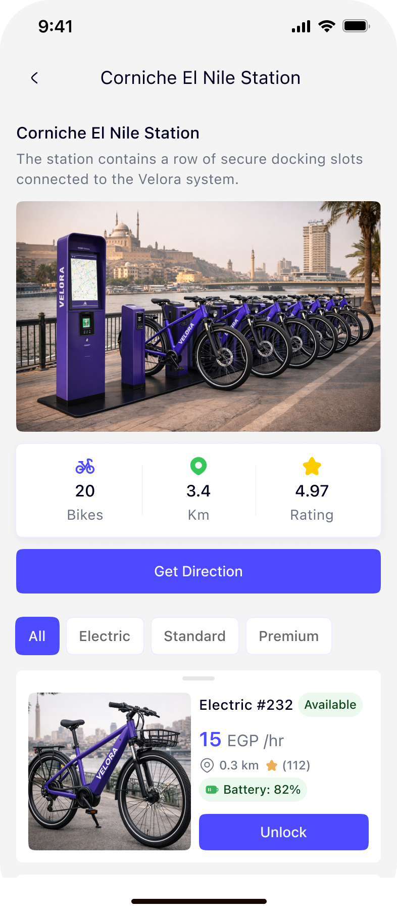
Map, then the station page: the distance stated as 3.4 km, with Get Direction above the list
Deciding to walk comes before choosing a bike, so the direction outranks the list
Is there a bike there right now?
A live count on the station page, plus an Available badge on each bike
A wasted walk is the failure that loses a user permanently
What kind of bike, and will it last?
All / Electric / Standard / Premium filter, with battery level and range on each bike
Battery is the electric-bike form of availability; unstated, it becomes anxiety
What will this cost me?
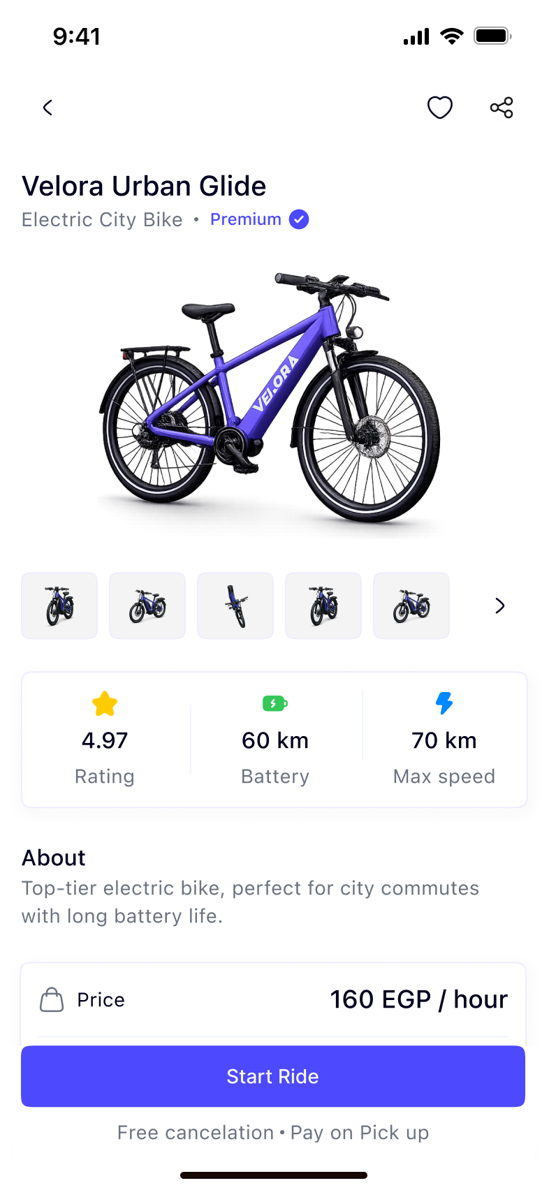
Price per hour on the bike card, and again directly above Start Ride
The price has to be visible at the moment of commitment, not after the ride
How do I actually unlock it?
One instruction on the scan screen, with manual code entry underneath it
The unlock is the only step that can physically fail; it needs a second route
Did the ride end properly?
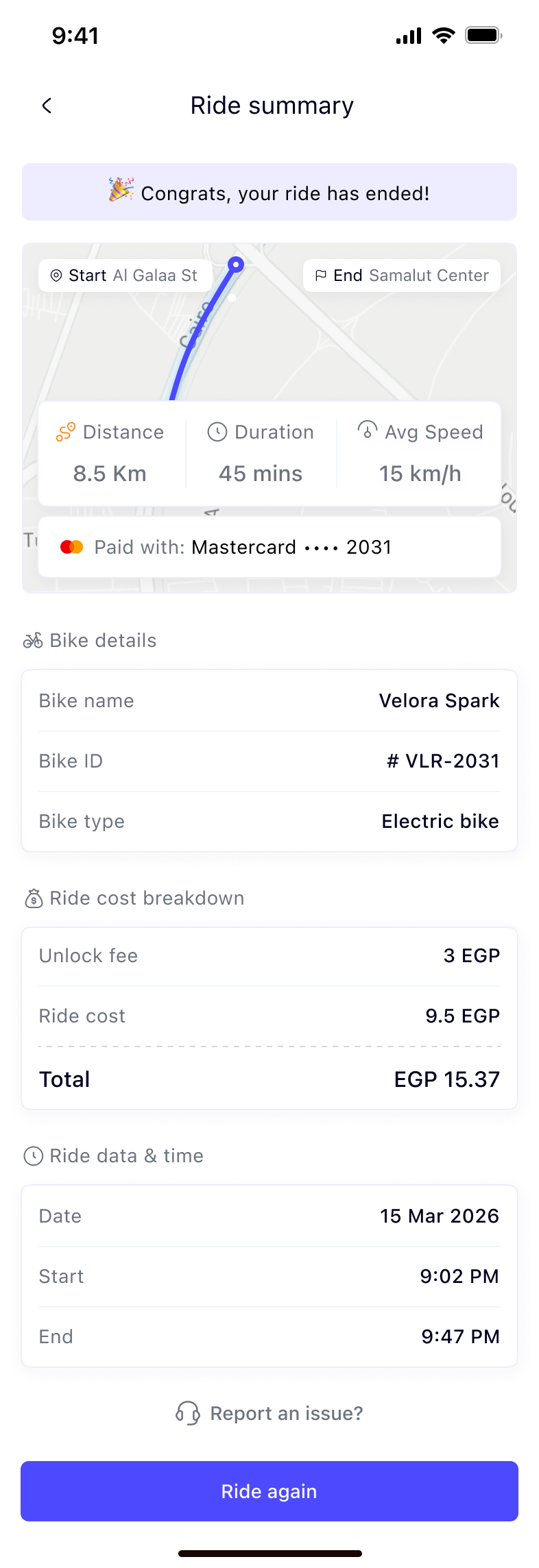
A summary that confirms the ride ended, itemises the cost and names the card that paid
An ending that is not confirmed reads as a ride still running, and still charging
04 · The journey
One rental, seven screens, no dead ends.
The flow is linear on purpose. Each screen either answers a question or takes an action, and every screen says what the next one will do.
01StationTwenty bikes, 3.4 km, rated 4.97: the three numbers needed before deciding to walk, stated before anything else. · scroll
02BikePrice, availability and pickup location sit in one block, so the decision is made in a single glance. Reviews come after it, for the people who want them. · scroll
03UnlockThe camera fills the screen, one line explains the task, and a manual code entry waits underneath for a scratched sticker or bad light.
04StartThe scan lands on the same bike, now with one action. Free cancelation and pay on pick up sit under the button, where hesitation happens.
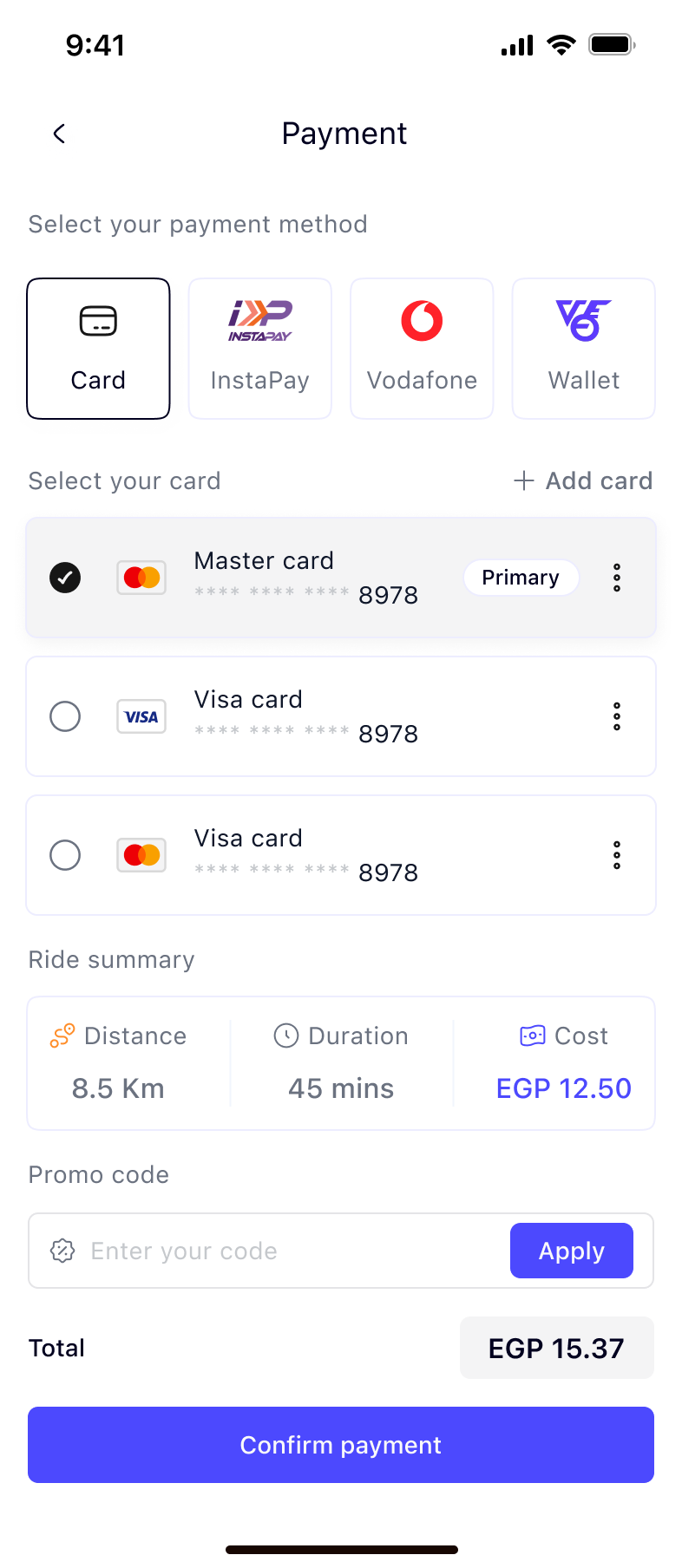
05PayCard, InstaPay, Vodafone and wallet carry equal weight, because in Cairo the card is not the default. The ride summary repeats above the total. · scroll
06SummaryDistance, duration and average speed over the route, then the charge split into unlock fee and ride cost. Nothing is left to be inferred. · scroll
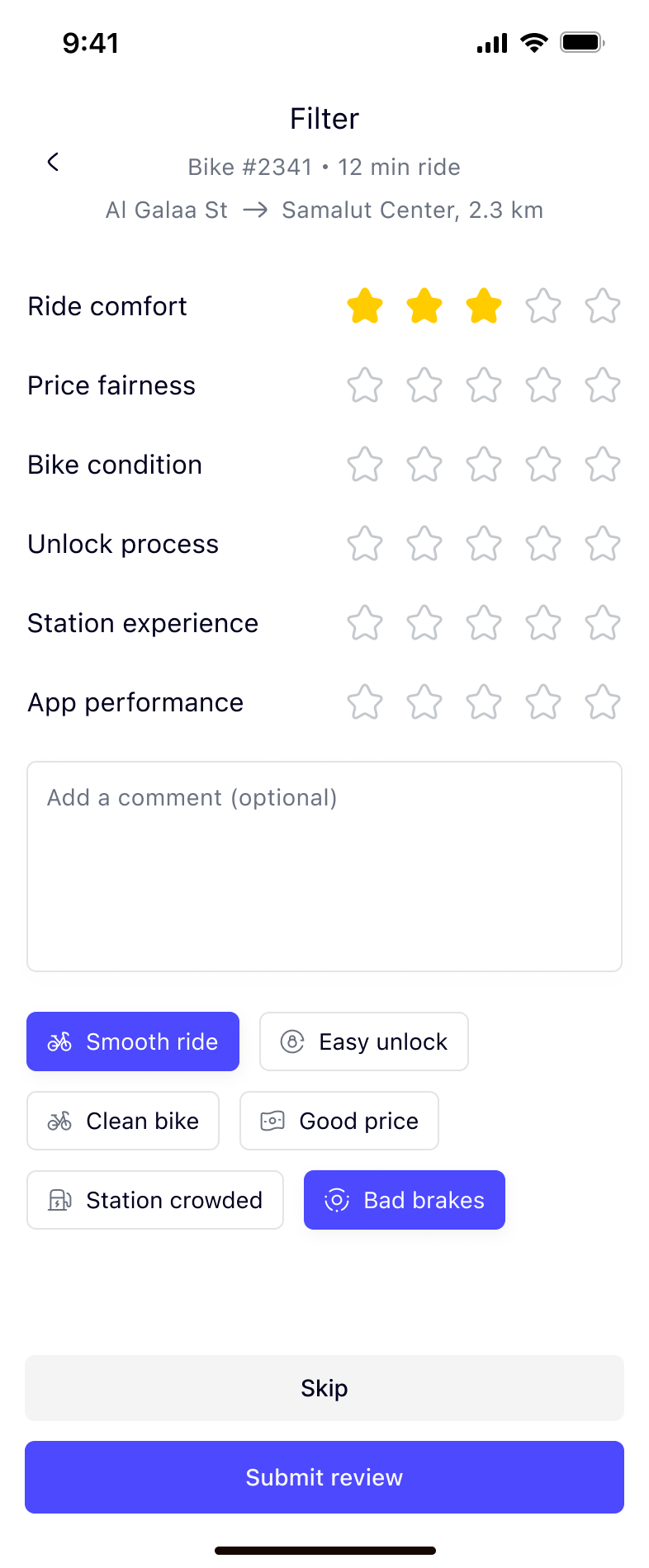
07ReviewSix specific things to rate instead of one vague star, plus chips for the complaints people actually have. Skip is a real button, not a grey link.
05 · Three decisions worth defending
D1
Availability is answered before the walk, not after it.
The station page leads with a bike count, a distance and a rating, and every bike in the list carries its own status, price, distance and battery level. A person commits to the walk already knowing what is at the other end.
The alternative, showing the station and letting people discover availability on arrival, is cheaper to build and loses the user the first time it is wrong.
D2
The unlock screen assumes it will sometimes fail.
Scanning is the one step that depends on the physical world: a scratched sticker, low light, a dirty lens. So the screen carries a single instruction, a frame showing exactly where to aim, and manual code entry pinned to the bottom.
It is phrased as the question the user is already asking, rather than an error the app announces after the fact.
D3
Cost is never a single number.
The price per hour appears before the bike is unlocked. The summary splits the charge into unlock fee and ride cost before the total, and names the card it was taken from. The payment screen repeats distance, duration and cost above the confirm button.
Pay-as-you-go services lose trust at exactly one moment: the final number. Itemising it is the cheapest way to earn a second ride.
06 · The physical half
A station service is half hardware.
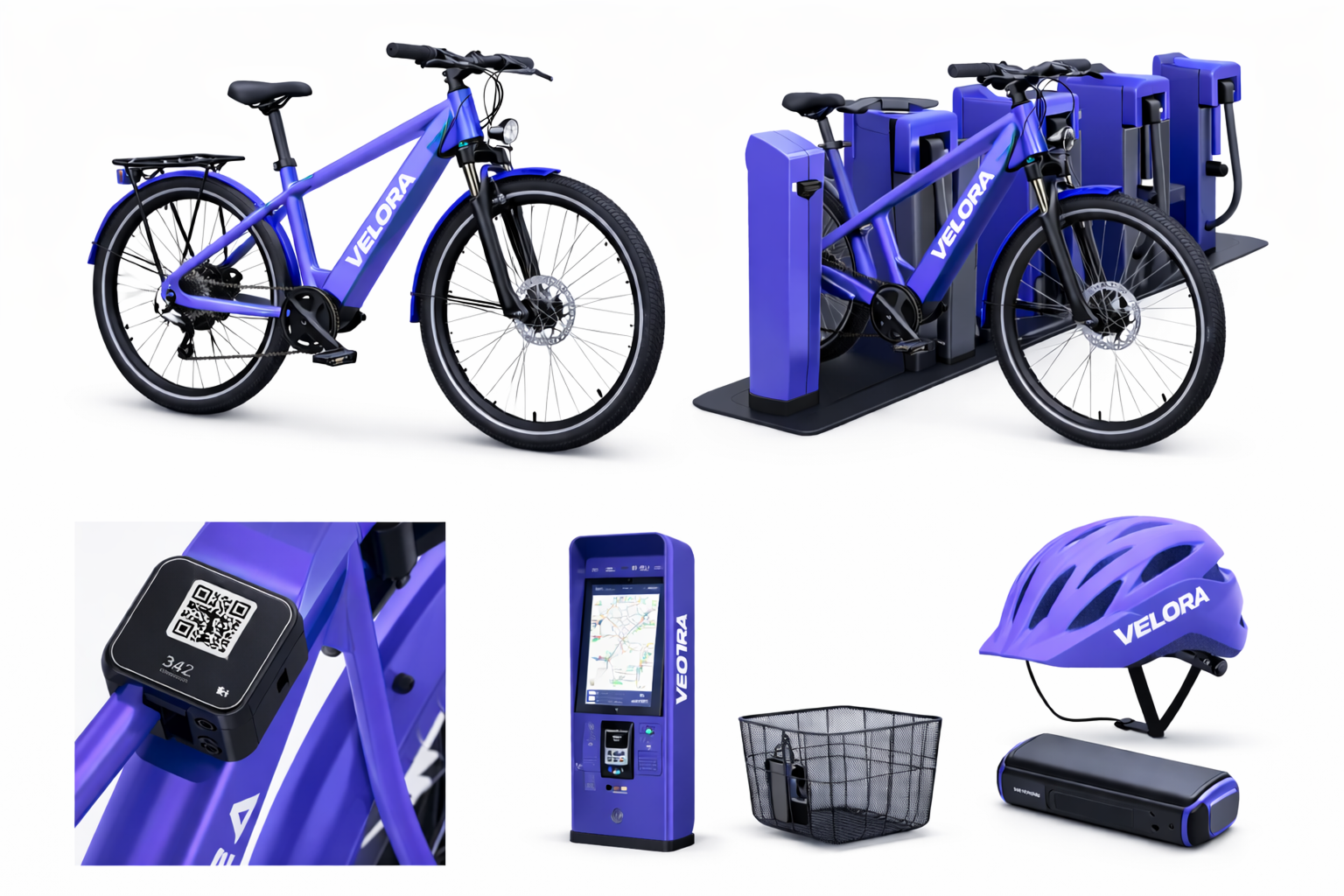
The dock, the QR plate on the frame and the station kiosk are where the app's promises are either kept or broken. The scan screen is designed around where that plate actually sits: chest height on the top tube, readable one-handed while the other hand holds the bike.
Bike, dock, QR plate, kiosk and accessories. The numbered plate is what the app scans, and the bike ID it prints is the one shown on the ride summary.
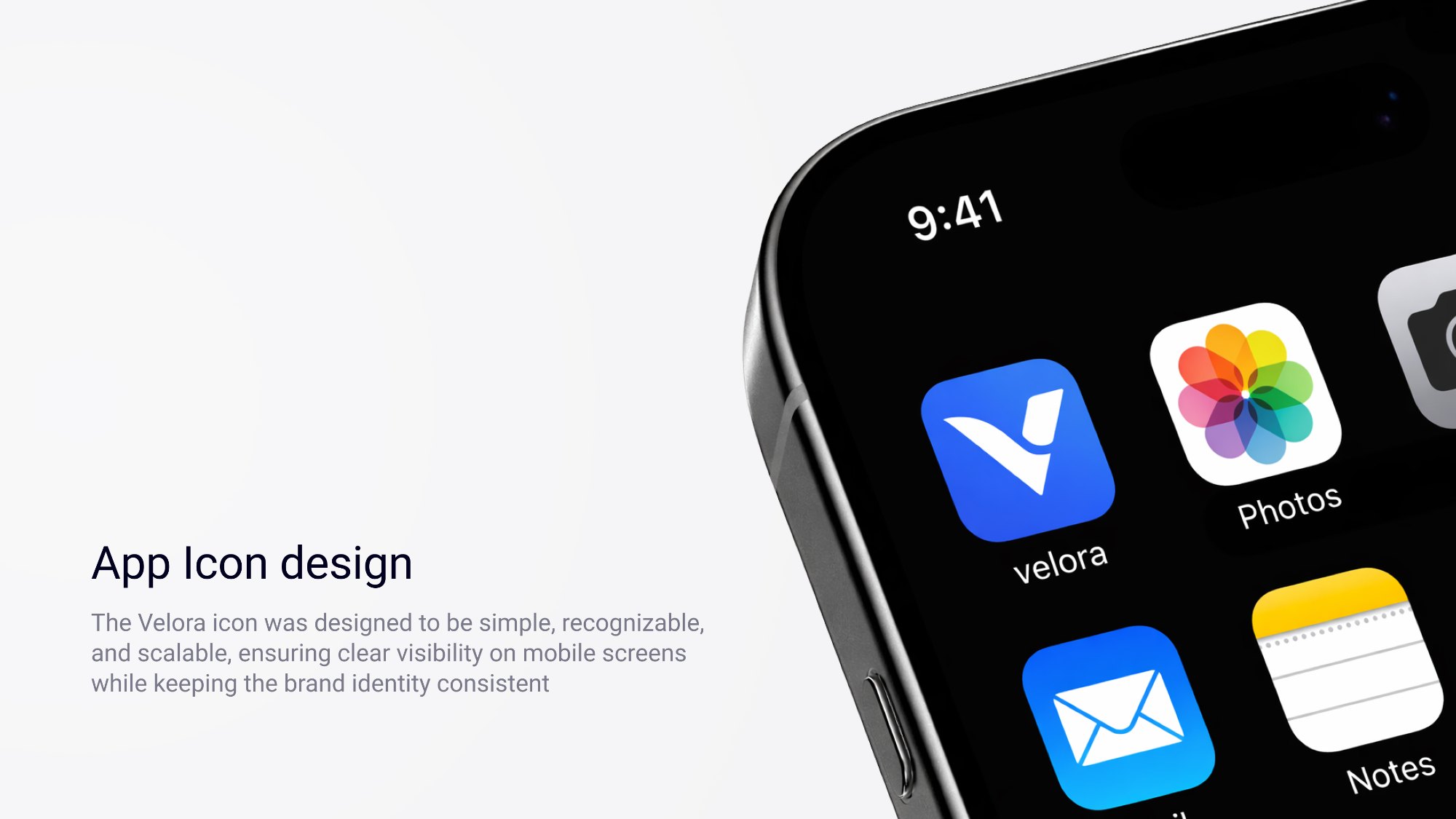
The icon is one mark, no wordmark and no bike. It has to stay legible at 40px next to the system apps it sits beside.
07 · What informed it
Before drawing screens I benchmarked the bike-share and rental services people already use, and ran a survey on how they make short trips across Cairo. Both are still to be written up here. The screens themselves have not been put in front of users, so these are the three tests I would run first.
What I would test next.
H1
Battery level decides which bike people pick, more than price does.
Test: an unmoderated choice task with battery and price varied independently across the station list.
H2
A first-time user can unlock a bike without help.
Test: five people at a real station, no instructions, measuring where they hesitate and how many reach for the manual code.
H3
An itemised total is questioned less than a single one.
Test: two summary variants, asking people to explain what they were charged for and whether the amount feels fair.
Contact
Tell me what you are trying to get people through.
Product or UX Designer roles. Remote, hybrid, or on site, open to relocation.
Wayfare is the trip planning product I am designing on a UX internship at Flyrank, an AI startup, since June 2026. The research phase set the argument. This is the interface that had to carry it: 79 screens across fifteen groups, on a token set and component library documented as I went. Forty-three of them get one person to a plan they trust. The other thirty-six are what happens after that, when a card is declined or a flight moves.
29 · Trip hub, overview: the plan after it exists
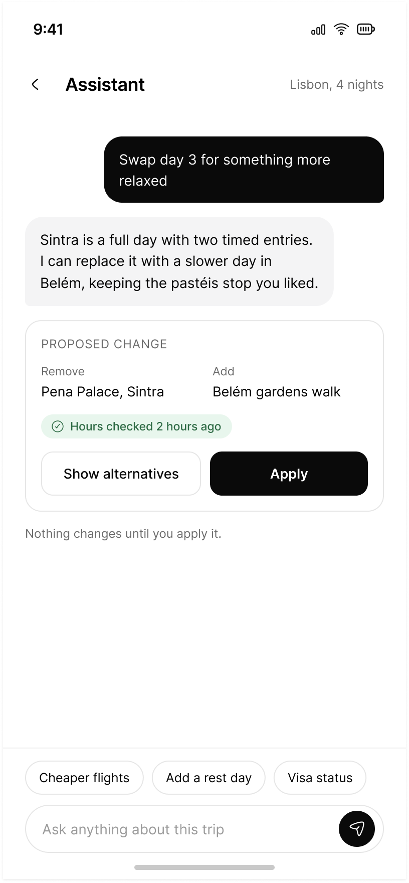
12 · Assistant: a proposed change, held behind Apply
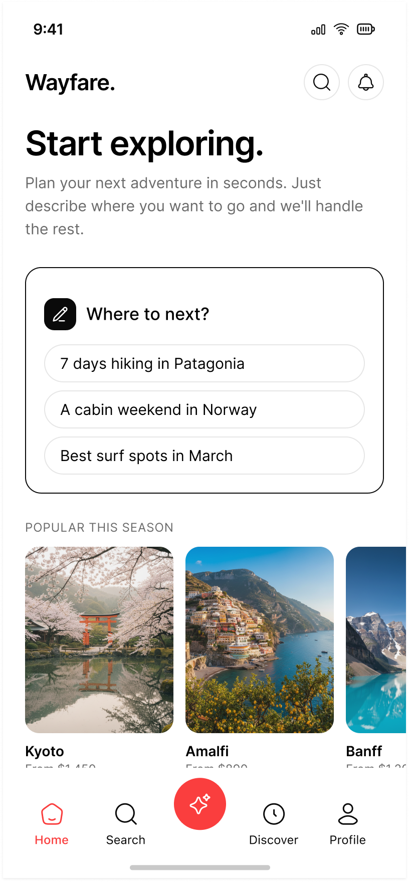
10 · Home: the first tap costs nothing
The problem with trip planning today
Planning happens in eleven tabs and ends in a notes app.
Flights in one place, stays in another, the actual itinerary written by hand somewhere neither of them can see. Every tool is good at its slice and none of them holds the plan.
The interesting question is not whether a model can draft an itinerary. It is what a person is willing to hand over, and what they insist on deciding themselves.
Wayfare answers it the same way on all seventy-nine screens: the product drafts, the person applies. Nothing moves on its own.
My part
Competitive research and survey design, the persona pack built from respondent data, and the UI set that came out of it: 79 screens in fifteen groups, the token collections and component library underneath them, and the Figma variables that make the prototype behave.
UX internship at Flyrank, an AI startup, since June 2026. Cleared for publication. Respondents are anonymised: names and ages are pseudonyms.
What the research settled
Three artifacts, one conclusion.
The survey and the competitor work agreed on where people stop trusting a planner: the moment it changes something they had already decided. Everything in the screens follows from that one sentence.
Competitor analysis
Where existing planners hand the work back to the user, and where the plan falls out of the product entirely.
A live survey
How people actually plan: what they book first, what they refuse to delegate, and what makes them abandon a draft.
A persona pack
Built from respondent data rather than invention, and used to settle arguments about defaults instead of taste.
A planner earns trust by showing its working. Every claim in the interface carries the time it was checked, and every proposal states its price before it can be accepted.
The set
Seventy-nine screens, fifteen groups, one frame size.
Every screen is drawn at 402 × 874. The groups are numbered in the order a person meets them, and the numbering is the file: screen 63 in Figma is screen 63 in the prototype and screen 63 in hand-off. Forty-three screens take one person from signing up to a plan they trust. The other thirty-six are what happens after that.
79 screens15 groups402 × 874Inter, one family
Auth and onboarding
09
01 Splash
02 Sign up
03 Log in · error
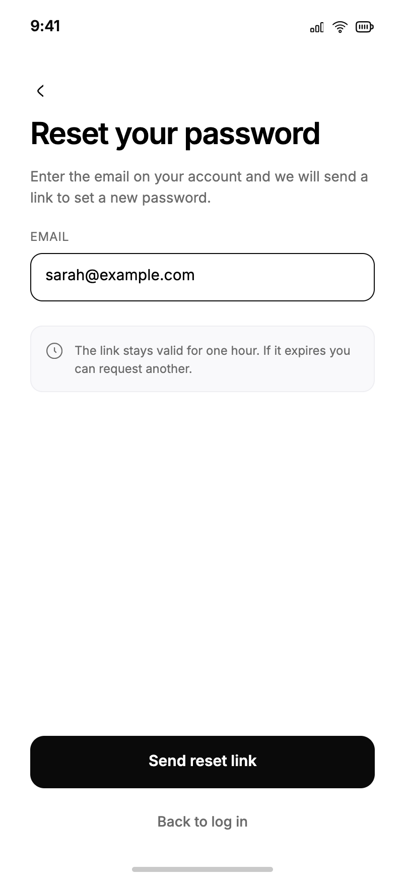
04 Forgot password
05 Verify identity
06 Welcome carousel
07 Travel preferences
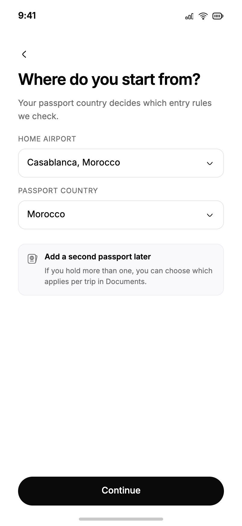
08 Home and passport
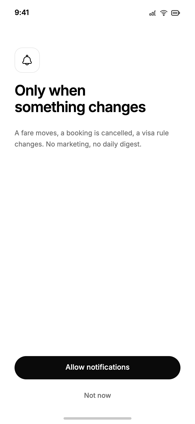
09 Notification prompt
Home and assistant
03
10 Home · empty
11 Home · populated
12 AI assistant chat
Discovery
06
13 Discover feed
14 Destination detail
15 Category browse
16 Search
17 Search results
18 Filters
Trip creation
10
19 Entry method
20 Destination
21 Dates
22 Travellers
23 Budget
24 Preferences
25 AI generation
26 Generation failed
27 Itinerary review
28 Activity detail
Trip hub
14
29 Overview
30 Flights
31 No flights found
32 Hotels
33 Restaurants
34 Attractions
35 Transportation
36 Budget
37 Documents
38 Packing list
39 Weather
40 Maps
41 Collaborators
42 Share
Account
01
43 Profile
Auth · extended
04
44 Log in
45 Reset link sent
46 Account created
47 Location permission
Assistant · extended
03
48 Assistant · start
49 Assistant · working
50 Notifications
Discovery · extended
03
51 Saved places
52 Search · no results
53 Results on map
Account · settings
06
54 Settings
55 Personal info
56 Notification settings
57 Payment methods
58 Help and support
59 Log out confirm
Booking
06
60 Fare options
61 Traveller details
62 Payment
63 Review and confirm
64 Booking confirmed
65 Payment declined
Trips
04
66 All trips
67 Drafts
68 Past trip recap
69 Delete trip
In trip
05
70 Today
71 Boarding pass
72 Delay disruption
73 Re-plan proposal
74 Offline mode
Editing
03
75 Add activity
76 Time conflict
77 Reorder day
Collaboration
02
78 Invite collaborator
79 Service unavailable
The map is a screen in the file, not a diagram drawn afterwards. It is how I found the gaps: the first pass had no offline mode, no time conflict, and no way to leave a trip you had been invited to.
Flow 01–09 · Auth and onboarding
Say what it costs before you ask for it.
Nine screens, and the only one that asks for anything speculative is the last. Each prompt names what it will do with the answer, and each one can be declined without ending the flow.
04Forgot passwordThe reset screen commits to a number: the link stays valid for one hour, and another can be requested. Not a vague instruction to check your email.
08Home and passportIt explains itself before it asks. Your passport country decides which entry rules we check, and a second passport can be added per trip later.
09Notification promptOnly when something changes. A fare moves, a booking is cancelled, a visa rule changes. No marketing, no daily digest. Not now sits under it as a real button.
01 · 02 · 03
Sign up offers Apple and Google above a password field that states its own rule (At least 8 characters) before it can be broken. The log-in error names the field that failed rather than the attempt: That password does not match our records, with Forgot password directly underneath it.
3 entry paths · 1 error state · no blocking modals
05 · 06 · 07
Verification says how long the code lasts and counts down the resend. The welcome carousel makes one promise, Every plan, checked, and it is the promise the rest of the product keeps. Travel preferences collects pace, budget tier and interests as chips, with Skip in the top right.
9 interest chips · 3 pace states · 3 budget tiers
Flow 10–12 · Home and assistant
Nothing changes until you apply it.
This is the contract the whole product rests on, and the assistant is where it is easiest to break. The chat can propose anything. It cannot change anything.
10 · Home, empty
The empty state makes the first move.
Three seeded prompts, phrased the way a person would say it out loud: 7 days hiking in Patagonia, A cabin weekend in Norway, Best surf spots in March. Priced destination cards sit under Popular this season. The first tap costs nothing and returns something, which is the only job an empty state has.
12 · AI assistant chat
A proposal is a card, not a message.
Ask it to swap a day and it answers with a reason, then a Proposed change card: what is removed, what is added, when the hours were last checked, and two buttons. Show alternatives, or Apply. The line under the card reads Nothing changes until you apply it.
Screens 48 and 49 extend the same rule to a working state: the assistant says what it is checking while it checks, so a pause never reads as a change already made.
Flow 13–18 · Discovery
Search in sentences, because that is how the decision is phrased.
Nobody starts with a place name. They start with a constraint: four days, under eight hundred, somewhere warm, no visa. So the search screen offers those as descriptions rather than filters, and says so in one line: Search understands plain sentences, not just place names.
Four days, under €800No visa neededDirect flights onlyWarm in December
14 · Destination detail
It argues for itself, then dates the argument.
Lisbon leads with three numbers, then Why it matches you as three checked lines, one of which is a warning: a Schengen visa is needed for your passport. Best time to go marks the user’s own dates against the year. Under it: prices are the lowest verified fare and a four-night stay in October, checked against the operators two hours ago.
17 · 18 · Results and filters
A budget cap tells you what it is hiding.
Results carry a note rather than a silent cut: Three more are just over budget — raising the limit to €900 adds Porto, Valencia and Naples. Filters name the trade the user is making, and the primary button counts the outcome: Show 6 destinations.
Flow 19–28 · Trip creation
Five cheap questions, one expensive answer.
Destination, dates, travellers, budget, preferences. Each step is one question with a visible position in the sequence, so the cost of continuing is always known. Only after all five does the product spend anything: screen 25 generates, screen 26 is what happens when generation fails, and screen 27 hands the draft back for review before a single thing is booked.
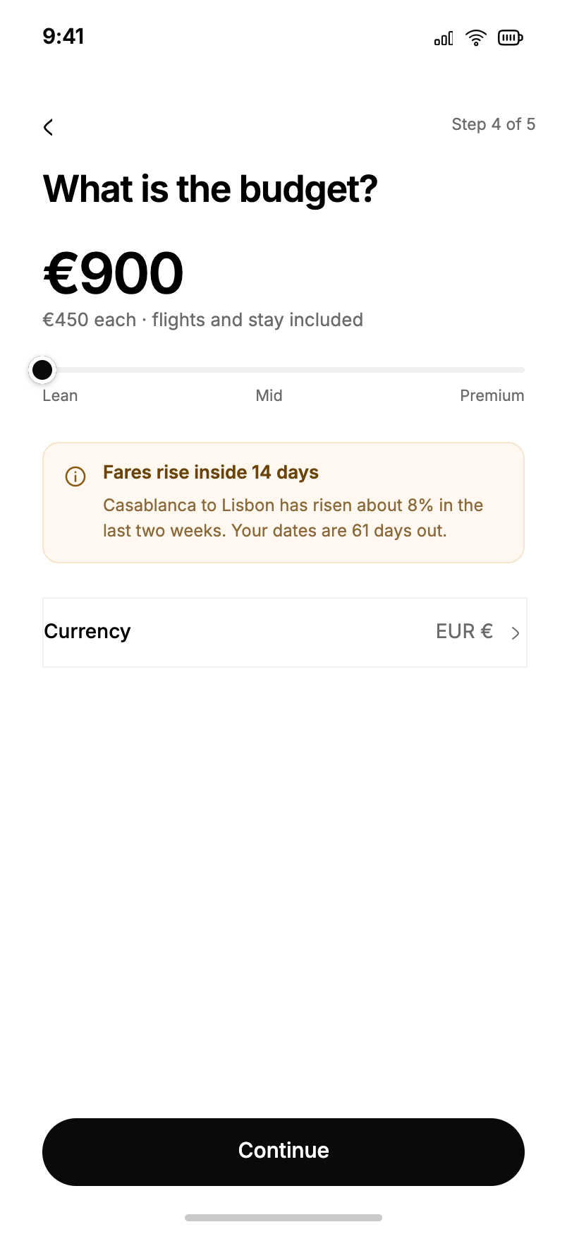
23Budget · leanThe tier and the number are the same control. Moving the thumb rewrites the amount and the per-person line under it.
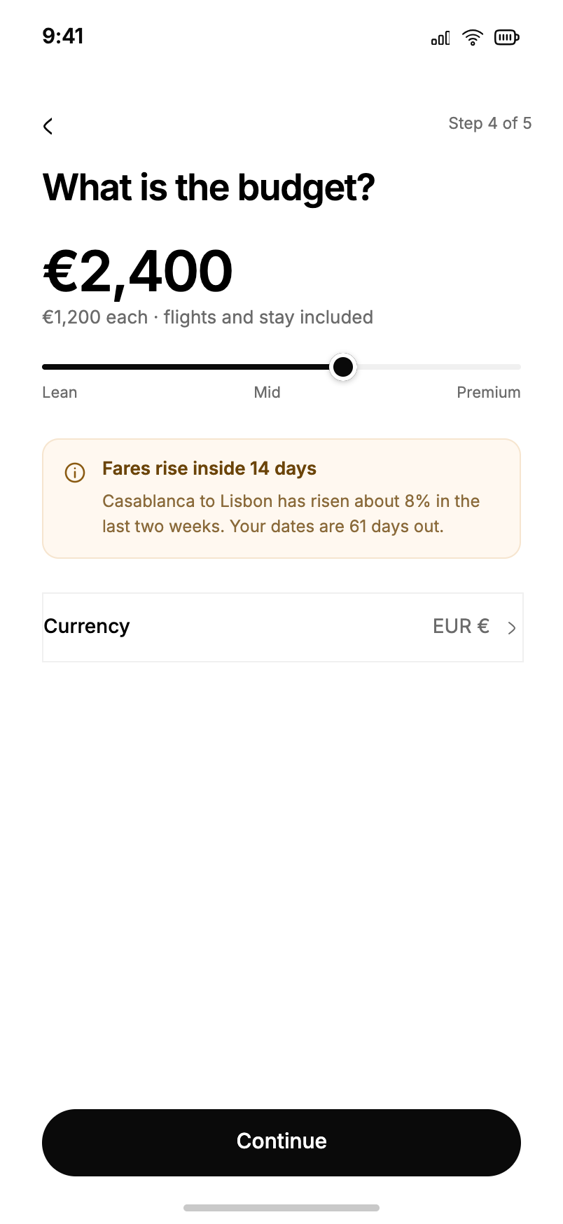
23Budget · €2,400At every stop the label reads €2,400, €1,200 each, flights and stay included. Underneath, a fare note that is dated: Casablanca to Lisbon has risen about 8% in the last two weeks, and your dates are 61 days out.
23 · Budget
The first version of this screen collected a tier and stated a total. It read as a filter, and people asked what the number actually bought. The revision puts both on one control and drives it from prototype variables, so the slider moves in the file: seven stops, each with its own amount label and subtitle. What used to be a claim is now a demonstration.
7 stops · 1 control · amount, split and inclusion in one label
26 · Generation failed
A draft that cannot be produced returns the money question, not an apology. The screen says what it could not verify and offers the nearest thing it can: fewer days, a different week, or the same trip without the timed entries.
failure states are designed at the same time as the happy path
Flow 29–42 · Trip hub
One trip, thirteen tabs, each answering one question.
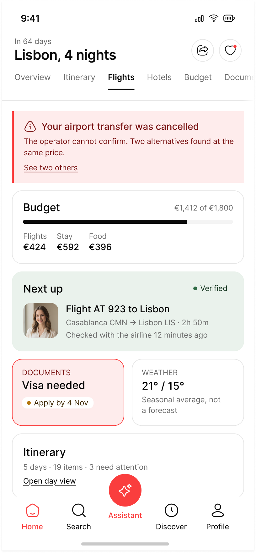
Once a plan exists it stops being a document and becomes a thing that changes. The hub keeps the same header on every tab, In 64 days · Lisbon, 4 nights, and gives each tab exactly one job. Overview is the only one allowed to interrupt: a cancelled airport transfer, two alternatives at the same price, and a visa that needs applying for by 4 November.
29 → 42 · what each tab is for
Overview
What needs attention today, before anything else
Flights
Which fare, and how long ago it was checked
Hotels
Which stays are verified and which are not
Restaurants
What is booked, what is only suggested
Attractions
What is timed entry, and when the hours were read
Transportation
How you leave the airport, and what each option costs
Budget
Where the money went, and which category is over its share
Documents
Whether you can legally enter, and by when
Packing list
What the weather makes necessary
Weather
Which day to spend outdoors
Maps
Where each day actually happens
Collaborators
Who changed what, and when
Share
Exactly what a link exposes
Every fact is dated.
Checked with the airline 12 minutes ago. Hours checked 2 hours ago. Price moved since last check. Timetable checked today. A verified badge with no timestamp is decoration; with one, it is a claim the product can be held to.
Money is never one number.
Budget shows €1,412 of €1,800 and €706 each, split across flights, stay, food and transport, with the remainder stated. When a category runs hot the screen says which and by how much: food is 32% over its share, and two restaurant bookings account for €65 each.
Sharing states its own limits.
A share link shows the itinerary; prices, documents and payment details stay private. Turning the link off revokes it everywhere, and people already invited keep their access. Both sentences are in the interface, not the help centre.
Flow 60–65 · Booking
Three steps to spend money, and one to be told no.
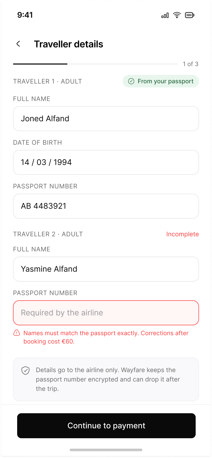
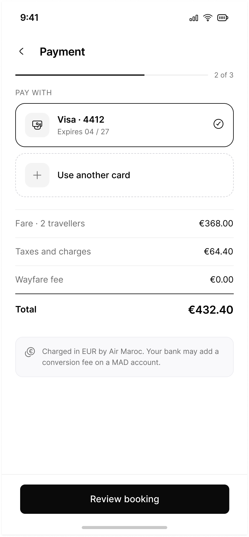
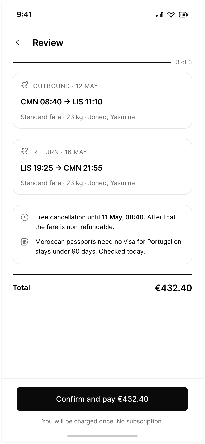
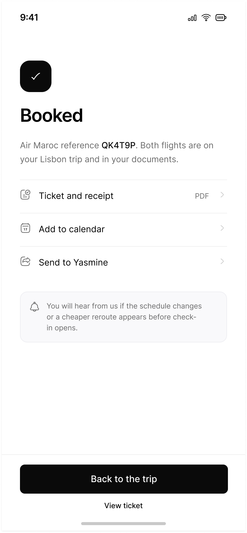
Booking is where a planner stops being a draft and starts costing €432.40. Screen 60 sets the fare, and the three steps after it are the only ones that touch money. The flow is deliberately short and deliberately loud about position: 1 of 3, 2 of 3, 3 of 3, each step carrying a progress bar and one primary action. Nothing is charged before the third step, and the third step spells out what charging means: you will be charged once, no subscription.
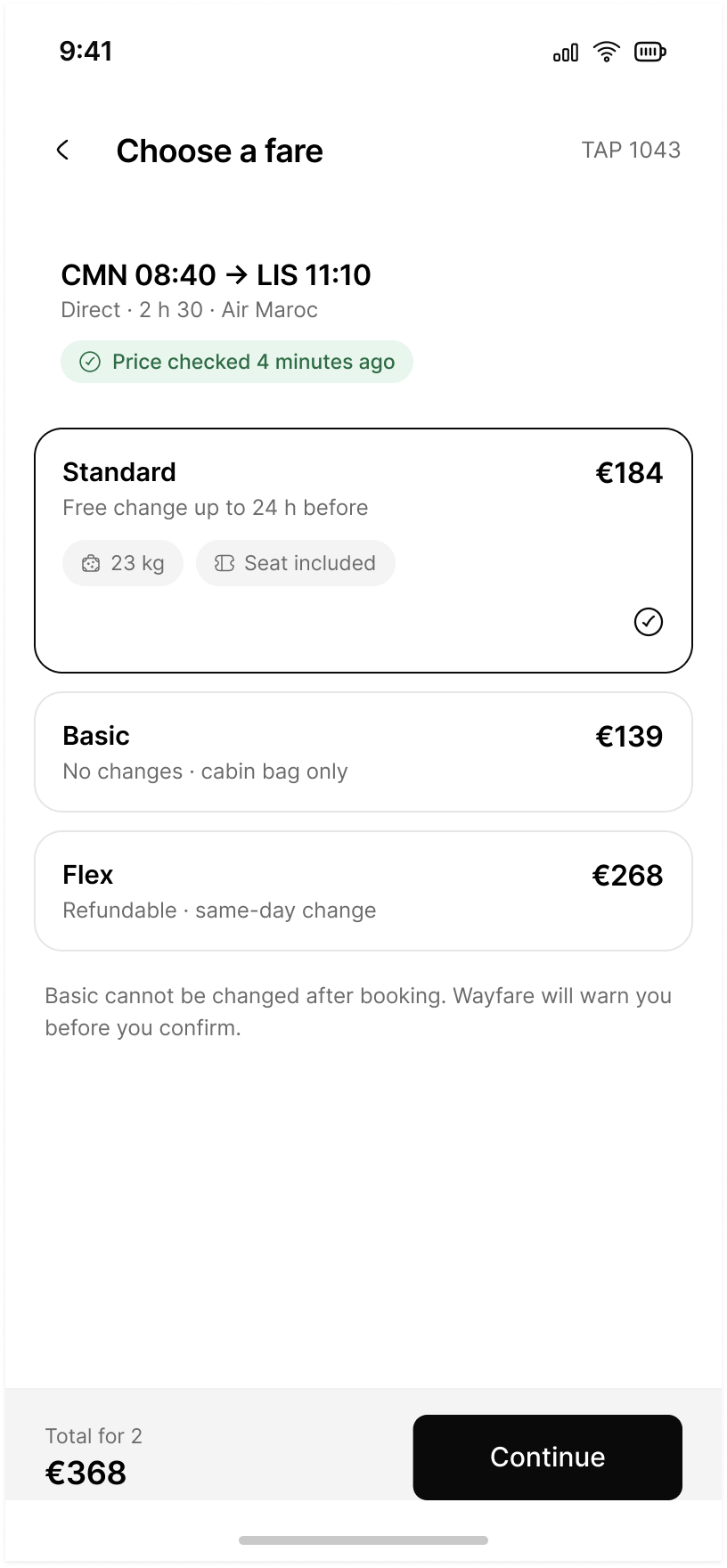
60Choose a fareThree fares described by what they let you do later, not by tier name: Standard €184 with a free change up to 24 h before, Basic €139 with no changes, Flex €268 refundable. The price carries its own timestamp, checked four minutes ago.
61Traveller details · 1 of 3Fields the product already knows are marked From your passport; the one it does not is marked Incomplete and priced: corrections after booking cost €60. Underneath, what happens to the passport number after the trip.
62Payment · 2 of 3€368.00 fare, €64.40 taxes, €0.00 Wayfare fee, €432.40 total. The zero is stated rather than omitted. So is the currency risk: charged in EUR by Air Maroc, and your bank may add a conversion fee on a MAD account.
63Review · 3 of 3Both legs, each with fare, baggage and the two names. Then the two things that are irreversible: free cancellation until 11 May, 08:40, and a visa answer that carries the day it was checked. The button repeats the amount.
64BookedOne word, a reference, and where the flights now live: on your Lisbon trip and in your documents. Three actions, no celebration. The last line is a promise about the future — you will hear from us if the schedule changes or a cheaper reroute appears.
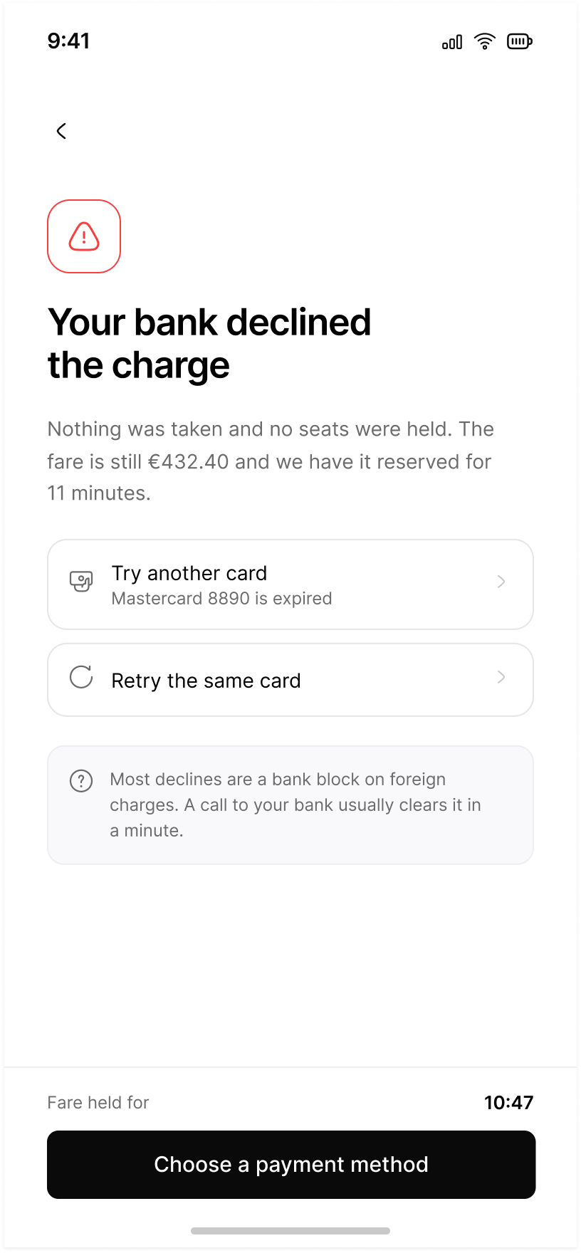
65DeclinedThe first sentence after the failure is what did not happen: nothing was taken and no seats were held. Then the fare, still €432.40, still reserved for 11 minutes. Two routes out, the expired card named, and the likely cause explained.
One number, carried forward
The fare screen totals €368 for two. Payment shows where the other €64.40 comes from and lands on €432.40. Review states it again and puts it inside the button. When the card is declined it is still €432.40. Survey respondents described the same fear in different words: that the number moves between the screen where they agreed to it and the moment they are charged.
60 · 62 · 63 · 65 · the amount never changes silently
The hold surfaces where it matters
During the three steps the footer holds a single action and nothing else: Continue to payment, Review booking, Confirm and pay €432.40. Fare held for 10:47 appears only on 65, where the remaining time is the fact the decision actually turns on. A countdown on every step would be pressure; on the one screen where the fare could be lost, it is information.
1 primary action per footer · 1 countdown, at the point of failure
The dead end has the same shape
A declined card is the only point in seventy-nine screens where the product has to admit it cannot do the thing the user asked for while their money is on the table, so it gets the same structure as every other dead end: name what broke, say what was not lost, offer the nearest priced route out.
2 recovery routes · 1 named cause · 0 apologies
Failure and empty states
Every dead end carries a priced way out.
Ten of the seventy-nine screens exist only because something went wrong. None of them is a shrug. Each names the thing that broke, offers the nearest alternative with its price, and repeats the contract before anything moves.
31 · No flights found
No flights on 12 October, then three nearby dates with fares beside them: Saturday 11 October at €226, Tuesday 13 October at €212, Thursday 15 October at €271. Under them the consequence, stated plainly: moving the outbound day shifts the rest of the itinerary, and nothing changes until you confirm.
3 dated alternatives · 1 consequence · 1 confirm
Trip hub · hotel sold out state
Every room type for your dates is gone, and three nearby hotels have availability at a similar price: €189, €205, €152. Then the reassurance that matters most, because it is the thing people fear: switching hotels does not change your flights or other bookings.
3 priced options · 1 explicit non-consequence
65 · 79 · Payment declined, service unavailable
A declined card keeps the traveller details and the fare it was quoted at, and says whether the hold survives. Service unavailable states what is unreachable and what still works offline, which is the point of screen 74.
the plan is never lost by the product failing
Flow 44–79 · The second pass
The first forty-three screens were somebody’s first trip.
They took one person from signing up to a plan they trusted, and every one of them quietly assumed the plan would hold. The next thirty-six assume it will not: a flight moves, a card is declined, someone else edits the day you had already decided.
Groups 12 to 15 are the ordinary maintenance the first pass skipped: all trips and drafts, a past trip recap, deleting a trip, a time conflict when two activities overlap, reordering a day, and an offline mode that says which parts of the plan it can still show.
63Review and confirm
The last screen before money moves repeats both legs, the fare class, the bag allowance and the names on the ticket. Free cancellation until 11 May, 08:40. Moroccan passports need no visa for Portugal on stays under 90 days, checked today. The button carries the amount: Confirm and pay €432.40.
73Re-plan proposal
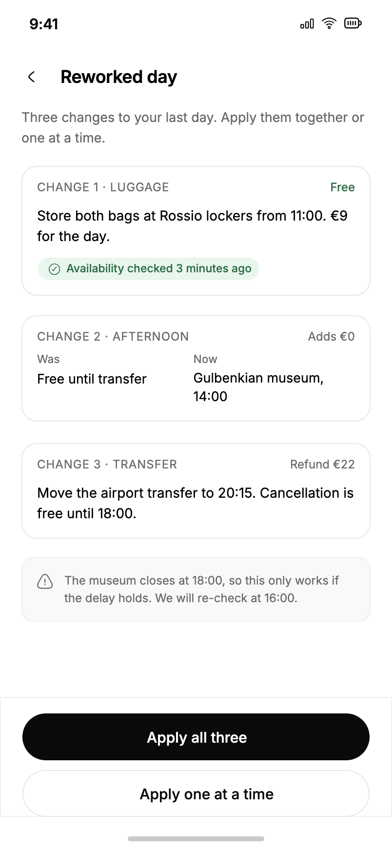
A delay does not produce a new itinerary, it produces three changes with prices attached: free, adds €0, refund €22. Apply all three, or one at a time. The caution under them is honest about its own assumption: this only works if the delay holds, and we will re-check at 16:00.
78Invite collaborator
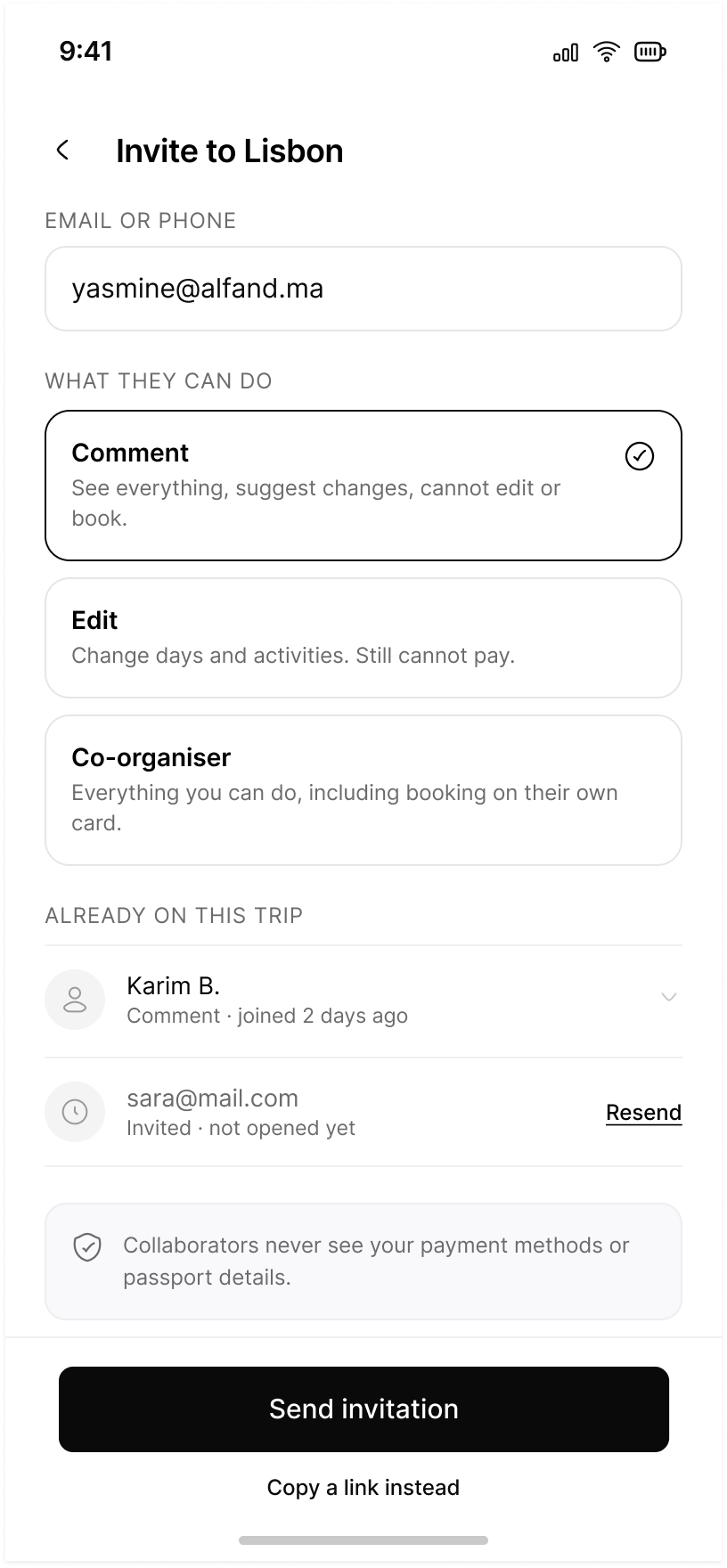
Permissions are described by what they cannot do. Comment cannot edit or book, Edit still cannot pay, Co-organiser can book on their own card. Pending invites show whether they have been opened, and one line settles the question people actually ask: collaborators never see your payment methods or passport details.
The system underneath
Tokens, then components, then screens. In that order.
Seventy-nine screens is past the point where consistency can be remembered. The file carries five Wayfare token collections and a component library built on them, so a change to a radius or a duration is one edit rather than seventy-nine.
Button carries 80 variants across style, size, state and icon, because it is the one component that appears on every screen and must never be improvised. Card and Input carry 15 each. Below them sit the small single-purpose sets the flows actually need: nine interest chips, three pace chips, three budget tiers, four calendar day states, traveller steppers, and an OTP digit.
A prototype that behaves
The interactive states are Figma variables, not duplicated frames. selectedStart and selectedEnd with a state per day drive the calendar, selectedPace drives three chips from one source, and budget/fillWidth with budget/amountLabel drive the slider. That is why the budget screen above can be moved instead of described.
Consistency across 79 screens
The rules I could not break without noticing.
One primary action per screen
It sits at the bottom, 48px tall, full width inside a 30px margin, and it carries the consequence in its label: Continue, Apply all three, Pay €432.40.
Every claim is timestamped
Verified, checked, moved. If the product asserts a fact it says when it read it, and if it cannot it says unverified instead.
Nothing changes until you apply it
Proposals are cards with prices. The verb is always the user’s. It appears in three flows and never contradicts itself.
Money is itemised before it is totalled
Split, share, remainder, then the total. A single number at the end is where trust is lost.
Declining is a real button
Not now, Skip, Show alternatives. Never a grey link under a black button.
One type family
Inter, at a fixed set of sizes. Numbers that must be compared are set in one weight so the eye can scan a column.
Contact
Get in touch if you want to see where this lands.
I am publishing this one as it happens. Happy to walk through the research and the screens behind it.
I design booking, planning and scheduling products: the ones people open when they are tired and want the thing handled. I work in Arabic and English, right to left and left to right, and I tend to start with the task a person is trying to finish rather than the interface they will finish it in.
How I got into design
I studied Business Administration. That is not the usual route into UX, and I have stopped treating it as a gap. It is the reason I ask what a product is for before I ask what it looks like, and the reason I am comfortable in the conversation where a design decision has to survive someone else's constraints.
The design part I learned by doing it, project by project, and by writing down what went wrong each time.
What I am still learning
I care more about whether it works than whether it wins an award.
Which is a nice line, and also the thing I have to keep proving. The clearest gap is moderated user testing: I have run heuristic evaluations and surveys, and I have not yet sat behind enough people using the thing. Three more are listed below, with the first step I am taking on each.
Task analysis, flow reduction, getting the sequence right before the screen.
Prototyping
Clickable Figma prototypes that behave enough to be argued with.
Design systems
Component libraries with documented states, tokens and annotated specs.
RTL and accessibility
Arabic interfaces designed to WCAG 2.1 AA, with the rules written into the specs.
Working with AI
Useful for a first draft. Every AI-drafted output gets checked against the source before it counts.
Closing this quarter
three, chosen because the work already needs them
Each one has a first step attached, so it is a plan rather than an intention.
01
Motion and prototyping
Wayfare has four motion tokens and nothing that demonstrates them. My prototypes behave enough to be argued with, and stop short of showing how a screen arrives.
First step: rebuild the Wayfare assistant flow with real transitions, so the Apply contract is legible in motion and not only in copy.
02
AI-augmented workflows
I work at an AI startup and use AI for first drafts, checked against the source before they count. That is a rule, not yet a method.
First step: write down the workflow I actually use for research synthesis, with the checking step named, so it can be handed to someone else.
03
Client scoping and pricing
I can run a project. I have not had to size one, price it, and say no to the parts that do not fit the budget.
First step: scope one of the three case studies backwards into a real proposal, with hours, deliverables and what would have been cut.
Remote, hybrid, or on site. Open to relocation. If the brief involves booking, planning or scheduling, or an Arabic interface that has to actually work, I would like to hear about it.